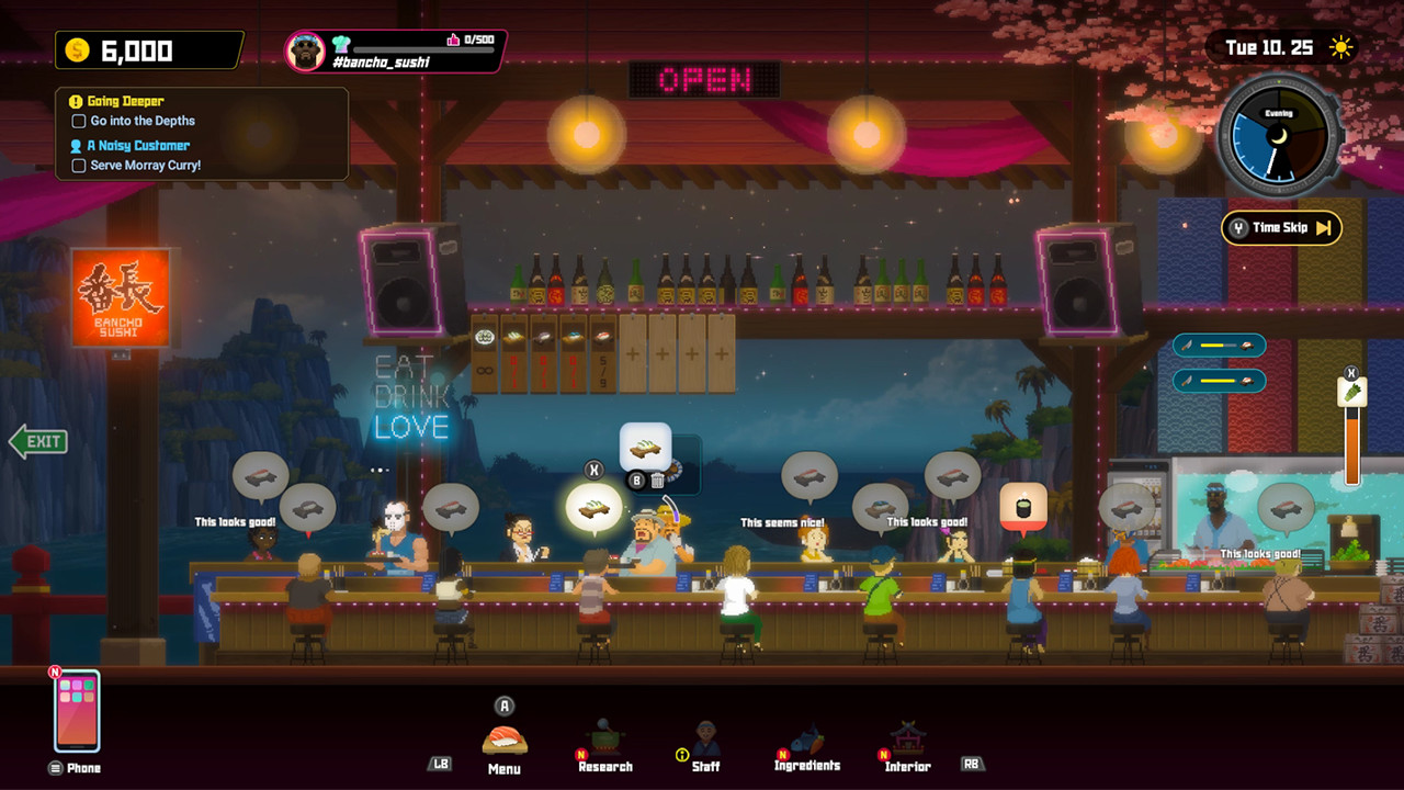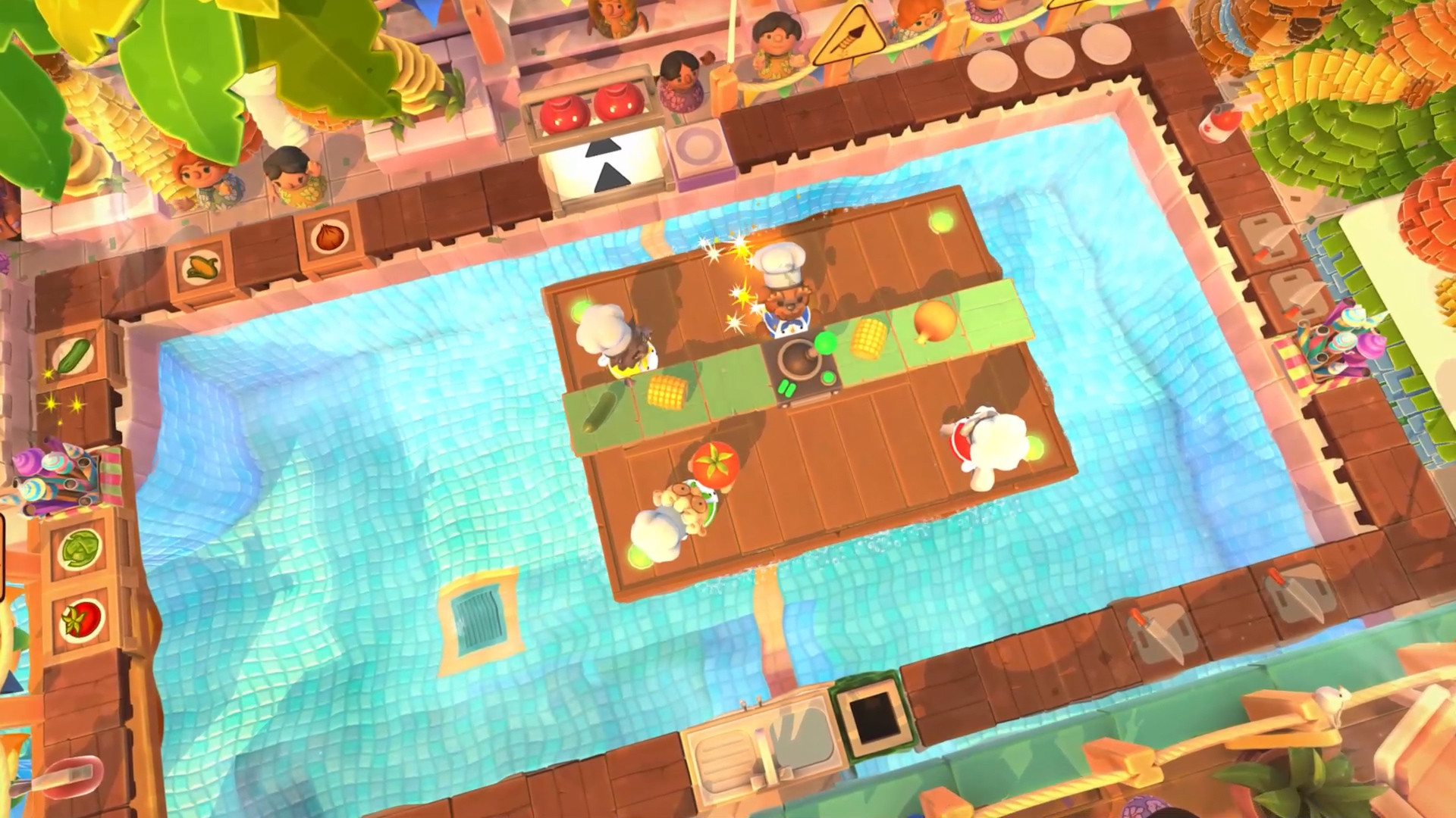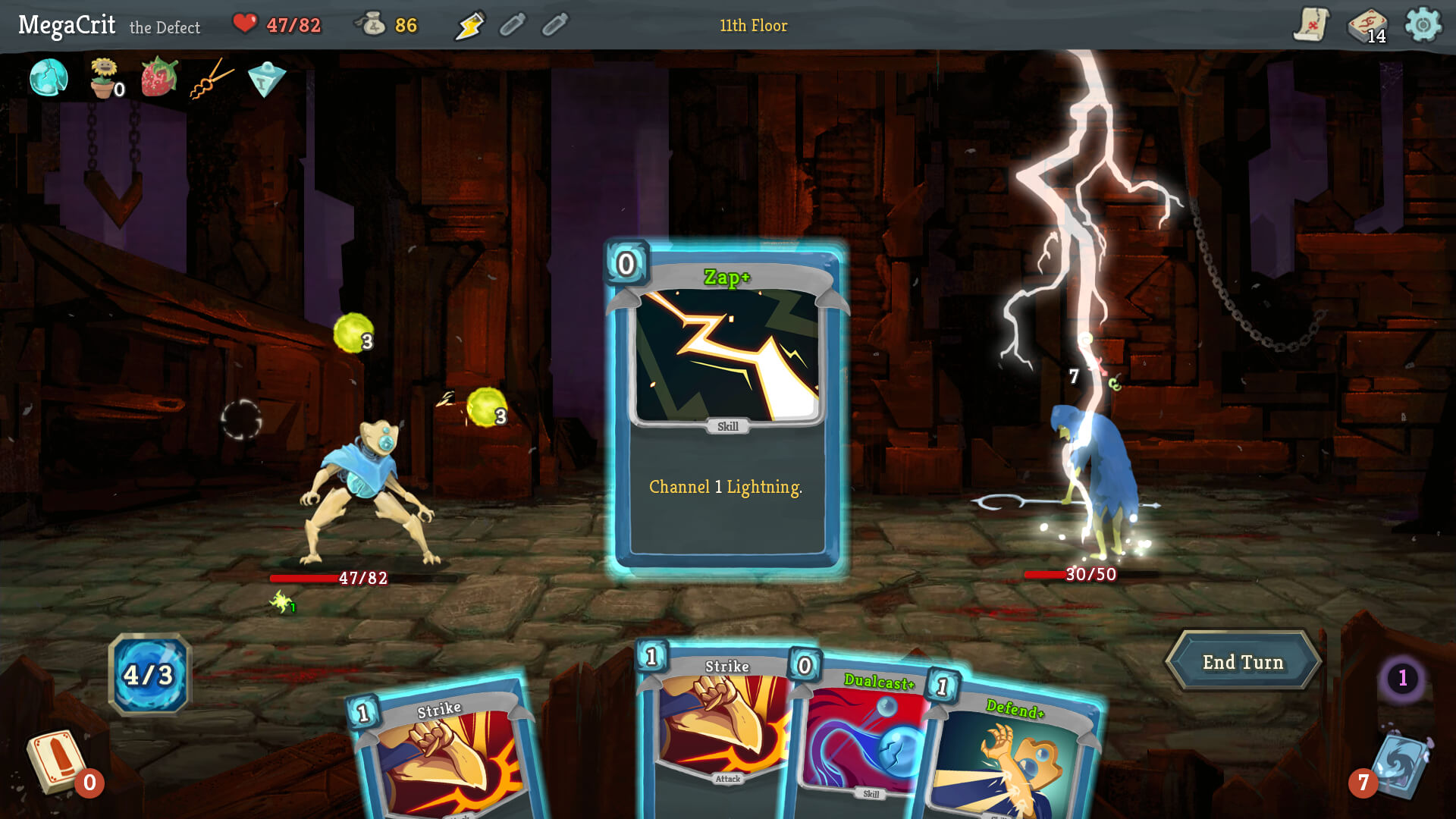
Test from your normal seat
Sit where you normally play and keep the television at its usual picture settings. Do not lean forward, pause a video to zoom, or judge from a phone held close to your face. Those shortcuts can hide the exact problem you are trying to find.
Use several minutes of ordinary gameplay with the full interface visible. A trailer often enlarges logos and dialogue for presentation, while the repeated game may depend on smaller objectives, item descriptions, button prompts, or status effects.
Check every kind of text you will need
Games rarely use one consistent text size. A readable main menu can lead to a tiny inventory, crowded skill tree, faint map labels, or notifications that disappear before you finish them. Open the screens that shape the type of game you plan to play.
- Subtitles and speaker names during both gameplay and cutscenes.
- Objectives, tutorials, interaction prompts, and temporary notifications.
- Health, resources, cooldowns, status effects, and mini-map labels.
- Inventory descriptions, upgrade comparisons, skill trees, and quest logs.
- Error messages and button glyphs that explain what to press next.
Look for text and interface scaling
A subtitle-size option does not necessarily enlarge menus or the heads-up display. Look separately for text size, subtitle size, HUD scale, interface scale, and menu scale. Change each option before starting if the game permits it, then reopen several screens to confirm that the setting applies consistently.
Xbox Accessibility Guideline 101 recommends considering the usual couch-to-television distance and allowing players to scale text. It also says icons and button glyphs should grow with text, because a larger sentence is little help when the control symbol beside it remains tiny.
Judge contrast while the background changes
White text can look clear in a dark menu and disappear over snow, sky, smoke, or a bright effect. Test subtitles, objective text, the mini-map, and interaction prompts in both bright and dark scenes. Look for a border, solid backing, adjustable background opacity, or high-contrast mode.
Xbox Accessibility Guideline 102 recommends strong contrast for important text and HUD elements, including subtitles and map information. The useful question at home is simpler: can you identify the words immediately without waiting for the background to become quieter?
Repeat the check in split-screen
Local multiplayer can shrink each player's view while leaving the interface just as dense. Confirm the number of local players you expect, start a real split-screen session, and check each panel from the least comfortable seat in the room.
Pay attention to player-specific objectives, prompts near the edges, inventories, and subtitles that may cover another player's information. If only one person can comfortably read the screen, the game may be a poor group choice even when its controls are welcoming.
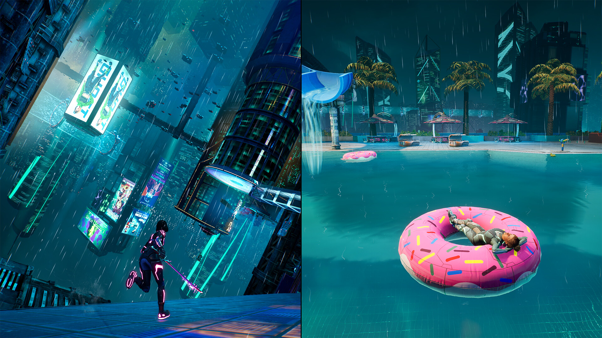 Split Fiction
Dividing a screen changes the space available to each player. Repeat the readability check in the view you will actually share.
Official screenshots: Split FictionRun a five-minute sofa test
From your normal seat, play or preview one ordinary section, open the pause menu and map, inspect one item description, and enable subtitles. Move between a bright and dark scene if possible. Increase the relevant display settings once and repeat the same route.
Keep the game on tonight's shortlist when essential text is readable without effort and the adjusted layout does not hide other information. If a repeated screen still forces you forward in your seat, choose another game for the television and save this one for a closer display.